

Gavin Anderegg
Vous l’ignoriez peut-être, mais le 14 mars est aussi le Jour de Pi! Qu’est-ce que ça a à voir avec les relations publiques, demandez-vous? Il s’avère que nos clients possèdent ou ont besoin de notre aide pour collecter de vastes quantités de données brutes. Plus que jamais, c’est le travail des professionnels des relations publiques de résoudre l’énigme qui se cache derrière tous ces chiffres. Dans son billet d’aujourd’hui, Gavin Anderegg, développeur principal au bureau de Halifax de NATIONAL, partage quelques exemples pour susciter votre imagination sur la façon dont vous pourriez raconter l’histoire de vos données. (Le billet est en anglais.)
———
π is a number with a story. By itself, it doesn’t mean very much — 3.14159… — but with a little bit of context it means a great deal. Before we get going, humour me a moment: π is the ratio of a circle’s circumference (the distance around the outside of the circle) to its diameter (the distance from one side of a circle to the opposite side, straight through the middle). It can help turn something easy to measure — a straight line — into harder to measure things: the length of a circle’s edge, or the area inside a circle, for example. If that sounds humble, consider that π (along with a bunch of other math) once helped us get to the moon and back.
So, what does this have to do with public relations? It’s the magic word the world is buzzing about: Data. Our clients often sit on, or need help collecting, vast quantities of raw data. More than ever, it’s the job of communicators to tell the stories of these numbers.
In many cases, we help our clients gather and interpret input from many people and groups. A great example of this is the Mactaquaction public engagement program for NB Power. We gathered online and in-person feedback from people all across New Brunswick to help inform NB Power’s decision about the future of the Mactaquac Generating Station. This vital piece of infrastructure provides about 12% of New Brunswick’s energy, but was deteriorating much faster than expected.
NATIONAL built a custom online tool to gather both quantitative and qualitative public feedback, taking pains to ensure questions were rigorous and exact. We needed answers that helped NB Power make well informed decisions, and had to be sure New Brunswickers would answer those questions sincerely. In total, data from more than 10,000 New Brunswickers was analyzed by the NATIONAL team and compiled into a final report. As a part of the final deliverable, we constructed a 3D printed model based on the data we collected.

Along with analysis, often we have access to data our clients need, but it’s hard to understand or communicate. In that case, presenting information to clients visually helps tell a story. For example, take identifying influencer. In the age of content marketing and social media, it’s something many organizations are focused on.
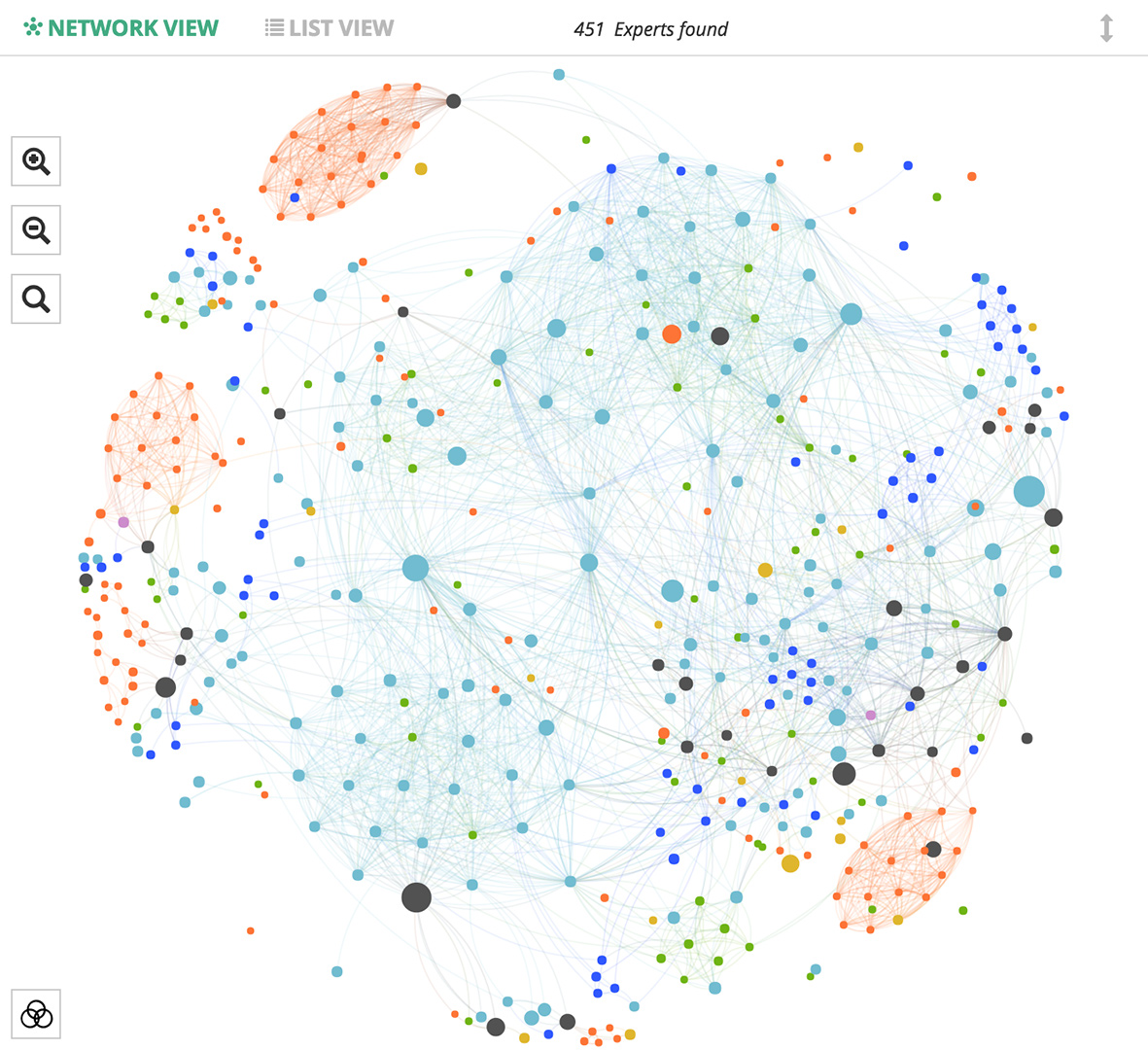
Who are the influencers within a network, and what motivates and inspires them? How do ideas spread? Who influences the influencers? This is the wonderful world of social physics. Recently, I built a custom network graph visualization and analysis tool that takes advantage of social physics, and other data science techniques. It reveals the connections across previously unlinked data sets, and helps to answer the questions above — often highlighting influencers in surprising places. It doesn’t matter what business sector or vertical we are working in: It’s data, and data can tell a story.
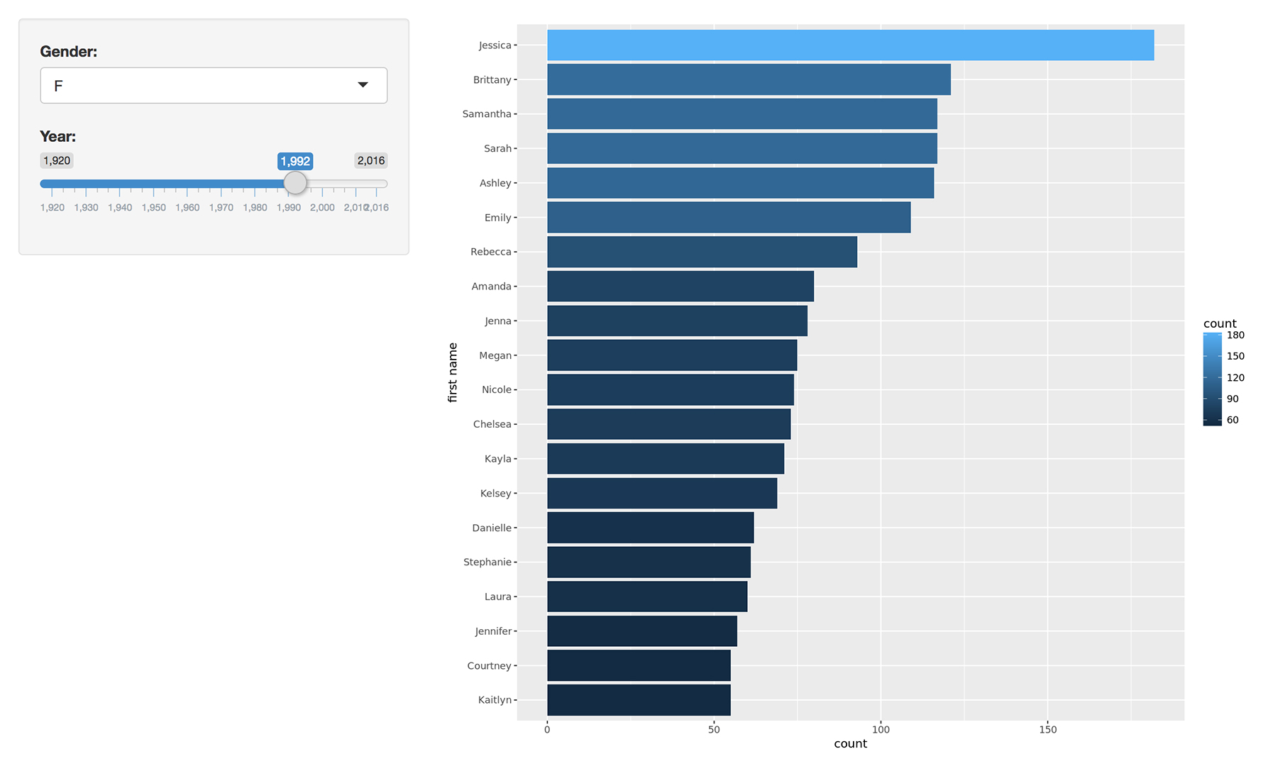
We can also use data to share our curiosity and help each other. Recently I found out that a co-worker was having a hard time finding a name for her soon-to-be-born child. Coincidentally, I stumbled on an open data set from the Nova Scotia government which shows the top 20 baby names per year by gender. I whipped together a quick visualization so she could explore this data easily. She subsequently shared the tool with others at her baby shower.
So happy π day! I hope one of these examples sparks your imagination about how you could tell the story of your data. If you need some final inspiration, just look to Albert Einstein — it’s his birthday today. He used π in his field equations to literally tell the story of how world goes ’round. Just think of the data you or your clients have available… who knows what wonderful insights might be hiding there.
——— Gavin Anderegg était développeur principal, Données et analyse au Cabinet de relations publiques NATIONAL


